

ARTICA is more than an online store –
it's a tribute to the art of pottery and ceramics. It is a visual journey curated to immerse the user in an atmospheric, calm, and minimalistic experience.
The Project
ARTICA is a personal project I developed during my studies at Careerfoundry. The main task was to design both a brand and an interface that matched the given brief. The brief outlined the need for an online store with a sleek and dynamic user experience, characterized by a modern and clean design. The key messaging emphasized the goal of making shopping easy for users. Additionally, the project required the creation of a responsive web application to ensure accessibility across various devices.
ARTICA is an online store specializing in selling exquisite, handmade pottery, and ceramics. It's the go-to store for individuals who appreciate elegant simplicity and uniquely crafted goods, valuing artisan craftsmanship. More than just an online store, ARTICA contributes to the preservation of artisan mastery and celebrates artisan craftsmanship by showcasing the stories behind the creation of the products and the artisans behind them.
My Role
My Role involved conducting all processes - from developing the idea, branding guidelines, to wireframing, testing and the final design.
TOOLS: Figma, Photoshop, Illustrator
Crafting the Core: Branding
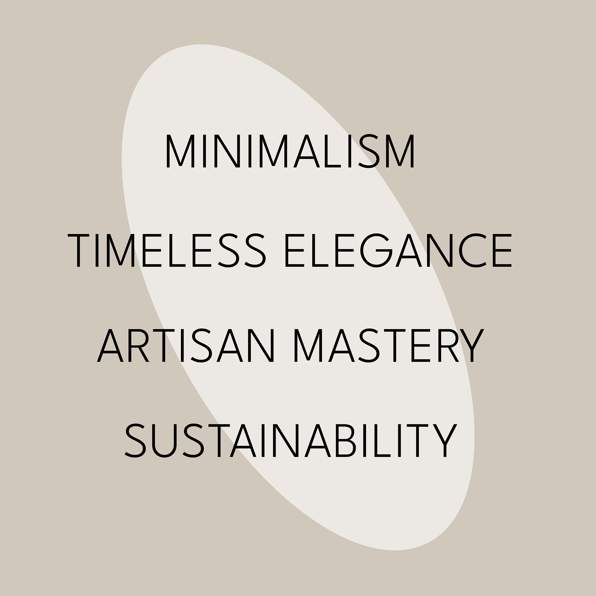
The values of Artica are seamlessly translated into the visual design decisions, shaping the visual personality of the brand.
Artica is minimal.
The design centers on simplicity, with clean lines and bold forms. Embracing a distinctive minimalism, the brand strives to showcase the unique beauty and simplicity of each handmade piece.
Artica is elegant.
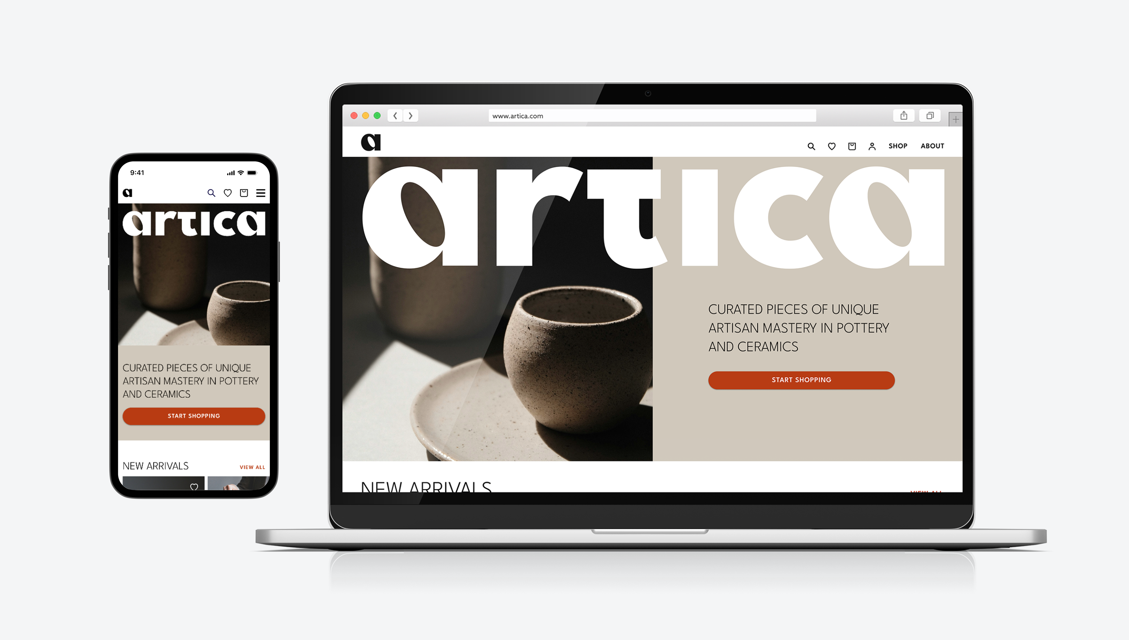
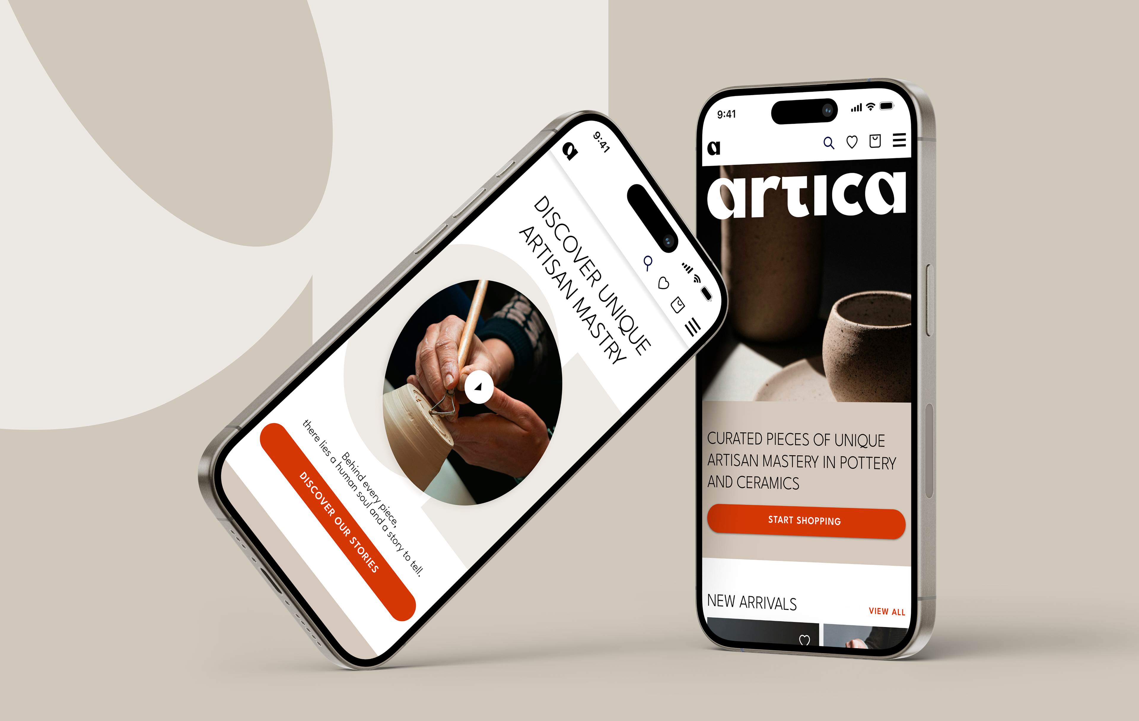
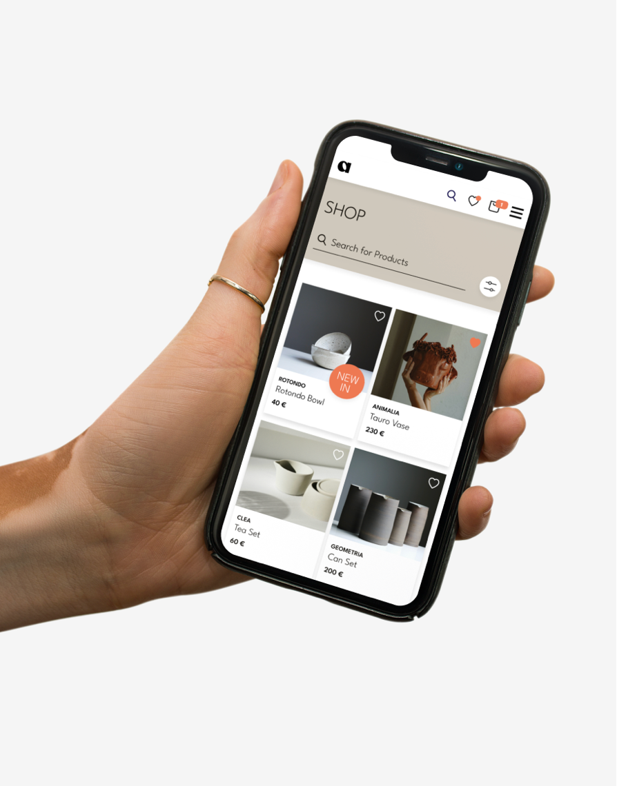
The online store design echoes this sentiment, featuring atmospheric product visuals and a clear, elegant layout that ensures a seamless shopping experience.
Artica is artisan.
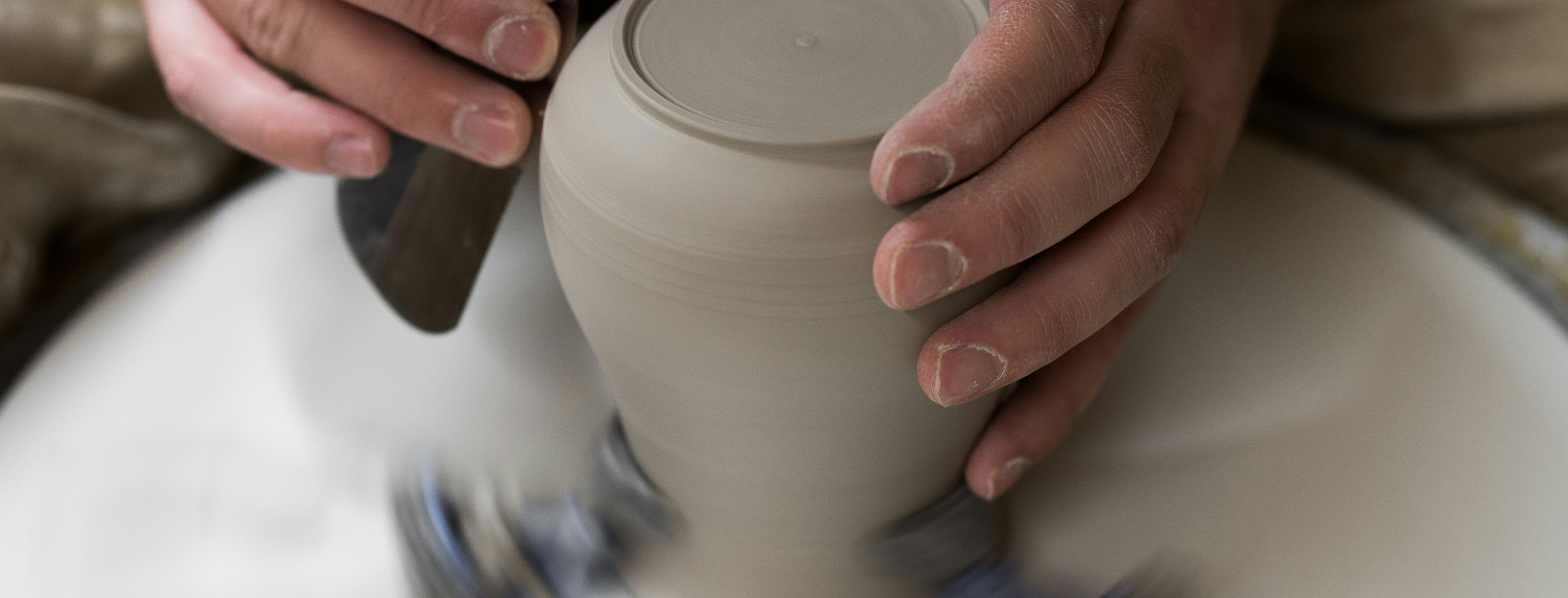
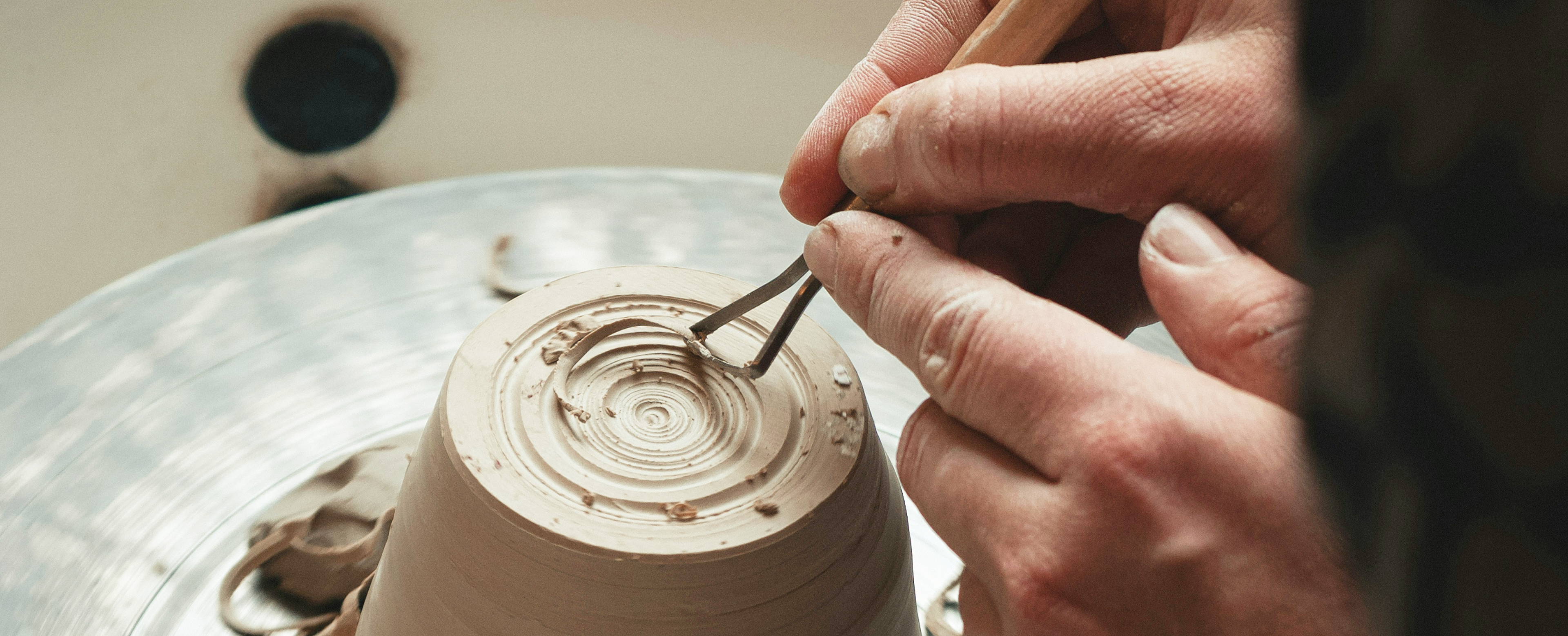
Each item in the collection embodies the expertise of skilled artisans, highlighting a dedication to artistry and craftsmanship. Through curated presentation and attention to detail, the brand honors the tradition and skill behind each handmade creation.
Artica is natural.
The visual identity mirrors the innate harmony found in the handcrafted pottery and ceramics. By embracing earthy tones and atmospheric product imagery, the brand captures the natural essence of its creations.
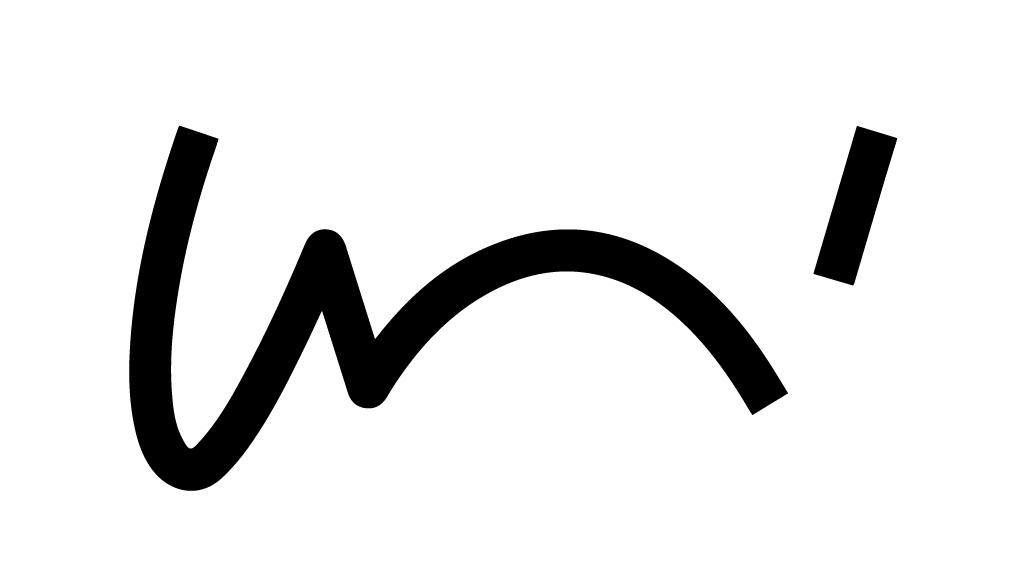
The name and the wordmark root in art and the artisan mastery involved in pottery creation.
Aligned with the brand's minimalistic personality, the wordmark showcases clean lines and bold, straightforward forms. With rounded forms and curves, the logo exudes a bold and grounded presence. The logo is designed for adaptability, fitting seamlessly in transparent contexts or over photographs. The standalone "A" is versatile, ideal for social media and mobile applications. Its bold design ensures it stands out independently, radiating a touch of minimal elegance. The letter "A" functions as an abstract vase, cup, or plate, embodying the brand's essence.
.
The typography use strikes a balance between straightforwardness and elegance, light lines and bold surfaces creating a distinct and individual character. In coherence with the values of minimalism and timeless elegance, the chosen font embodies a modern simplicity marked by clear forms and unique curves.
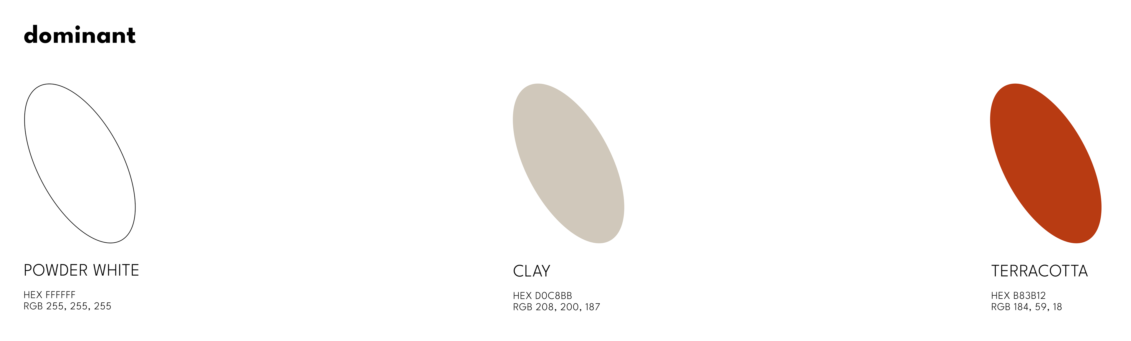
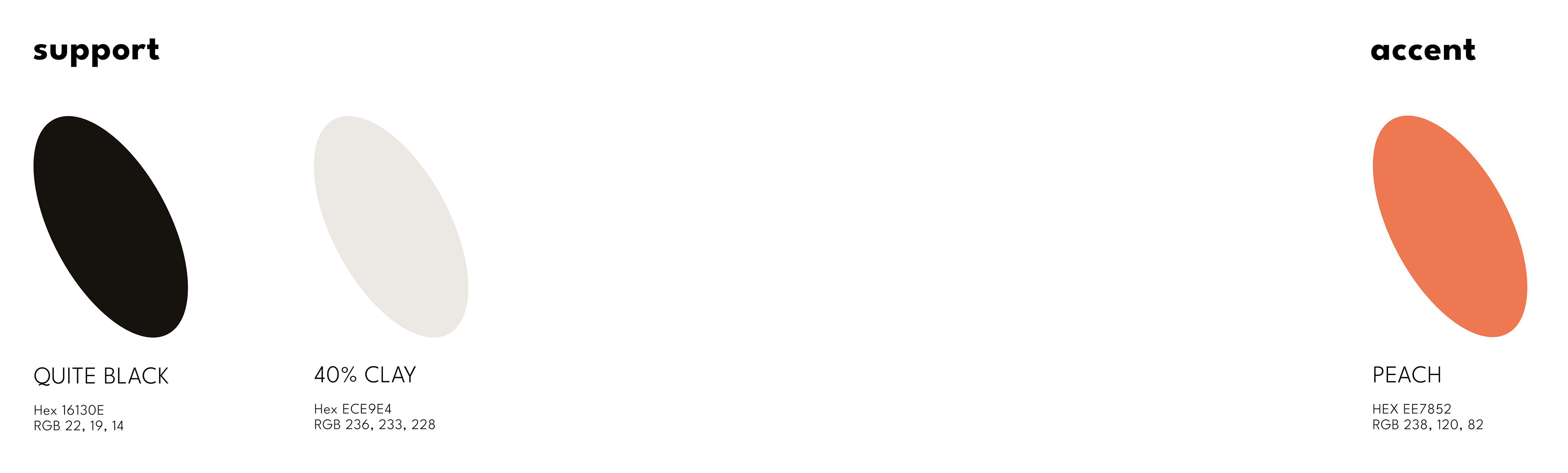
Artica's color palette pays homage to the natural materials artisans work with - clay, dust, and terracotta.
These earthy tones contribute to an overall harmonious aesthetic in the visual appearance of the Artica online shop. The color white acts as a clean canvas, presenting the visuals of the products perfectly.
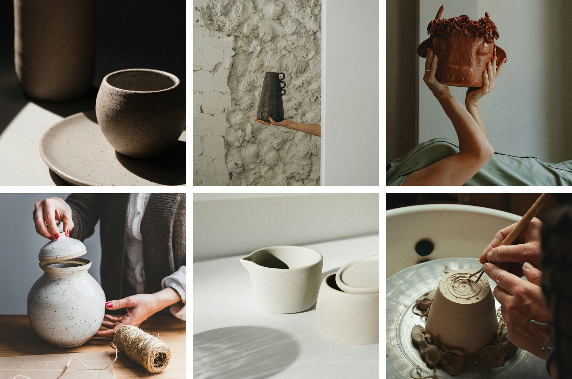
The visuals offer unique perspectives. They emphasize treasures, not just products, and showcase the human touch behind every creation.
Every detail is carefully attended to, presenting a round and bold aesthetic that captures the essence of the brand. The focus is on light and atmosphere, creating visuals that are both grounded and dynamic.
Shaping the Form: User Flows & Wireframing
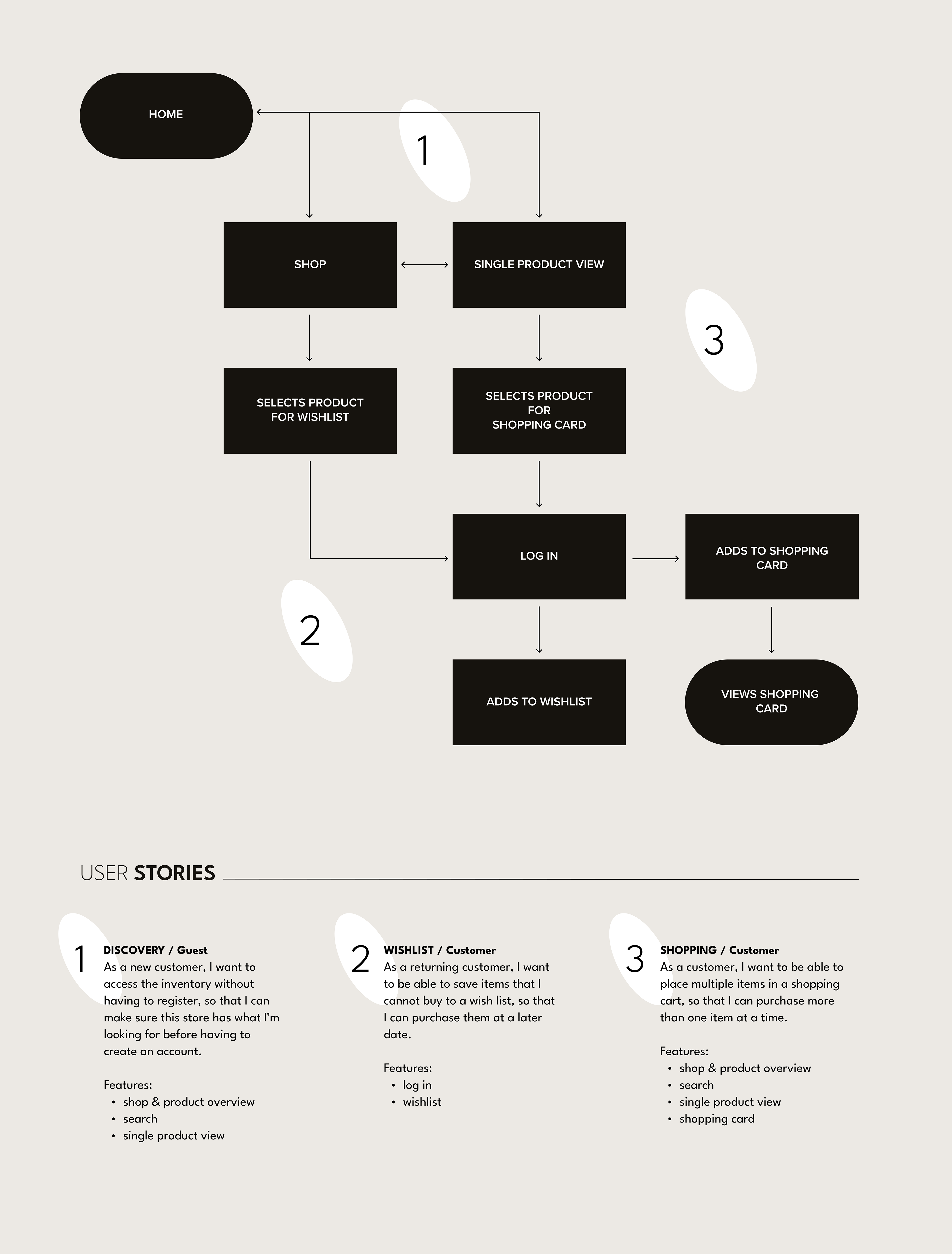
Drawing from the user stories and the extracted user flow diagram, I refined design decisions for the wireframing process. Beginning with sketching the screens, I progressed to digitally defining the layout and features. Once the mid-fidelity wireframing was completed,
I conducted a small user test with the objective of assessing functionality and user experience of the flow.
You can see the documentation of entire process here.