
ARTICA is more than an online store—it's a tribute to the art of pottery and ceramics. Designed to immerse users in a calm, atmospheric, and minimalistic digital space, ARTICA blends storytelling with refined aesthetics to elevate the shopping experience.
This independently developed project reflects a complete design process, from brand conception to responsive user interface design. The goal was to create a distinctive, minimalist brand that embodies clarity, elegance, and purpose. From naming and identity to interaction design and implementation, every element was crafted to support a seamless, intuitive e-commerce experience across all devices.
More than just a marketplace, ARTICA celebrates craftsmanship—highlighting the makers behind each piece and promoting appreciation for slow, intentional design.
My Role
I led the project end-to-end, applying creative direction across concept development, brand strategy, visual design, and user experience to deliver a cohesive and responsive e-commerce experience.
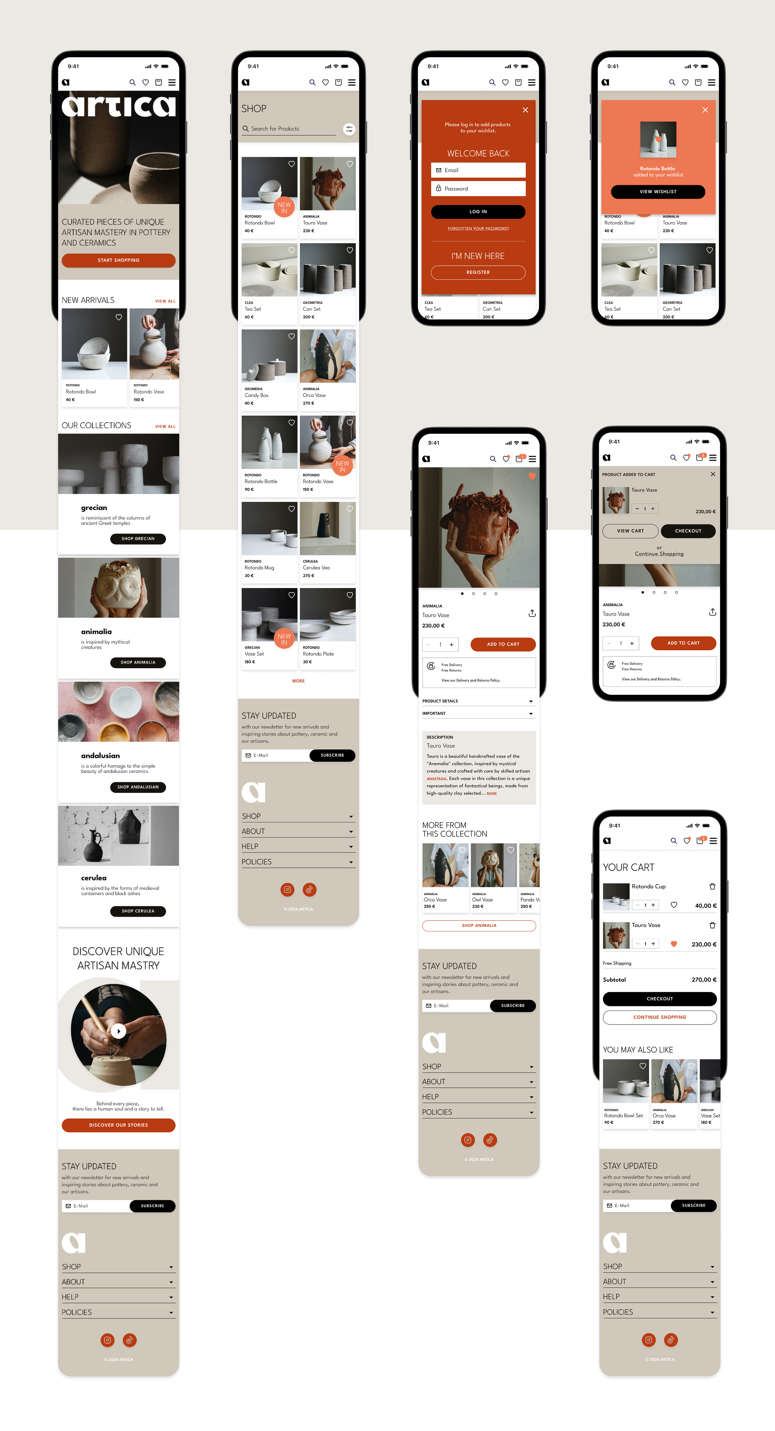
Key Skills Applied
🚀 Independent Leadership – Managed all creative decisions and execution independently, showing initiative and strategic thinking
✨ Creative Direction – Applied a holistic creative vision from ideation to execution, ensuring consistency and clarity across all design elements
🎯 Brand Strategy & Storytelling – Shaped a strong brand identity grounded in narrative, values, and emotional resonance
🌈 Visual Design – Created a minimalist aesthetic with a focus on clarity, elegance, and expression
📱 UI/UX Design – Designed a responsive, user-friendly interface aligned with the brand’s tone and functionality
💡 User-Centered Thinking – Prioritized accessibility and simplicity to deliver a seamless shopping experience
🧩 Design Systems – Built scalable components to maintain consistency across platforms
🛠️ Tools Used – Figma · Illustrator · Photoshop
Crafting the Core: Branding


The values of Artica are seamlessly translated into the visual design decisions, shaping the visual personality of the brand.
Artica is minimal.
The design centers on simplicity, with clean lines and bold forms. Embracing a distinctive minimalism, the brand strives to showcase the unique beauty and simplicity of each handmade piece.
Artica is elegant.
The online store design echoes this sentiment, featuring atmospheric product visuals and a clear, elegant layout that ensures a seamless shopping experience.
Artica is artisan.
Each item in the collection embodies the expertise of skilled artisans, highlighting a dedication to artistry and craftsmanship. Through curated presentation and attention to detail, the brand honors the tradition and skill behind each handmade creation.
Artica is natural.
The visual identity mirrors the innate harmony found in the handcrafted pottery and ceramics. By embracing earthy tones and atmospheric product imagery, the brand captures the natural essence of its creations.


The name and the wordmark root in art and the artisan mastery involved in pottery creation.
Aligned with the brand's minimalistic personality, the wordmark showcases clean lines and bold, straightforward forms. With rounded forms and curves, the logo exudes a bold and grounded presence. The logo is designed for adaptability, fitting seamlessly in transparent contexts or over photographs. The standalone "A" is versatile, ideal for social media and mobile applications. Its bold design ensures it stands out independently, radiating a touch of minimal elegance. The letter "A" functions as an abstract vase, cup, or plate, embodying the brand's essence.
.


The typography use strikes a balance between straightforwardness and elegance, light lines and bold surfaces creating a distinct and individual character. In coherence with the values of minimalism and timeless elegance, the chosen font embodies a modern simplicity marked by clear forms and unique curves.
Artica's color palette pays homage to the natural materials artisans work with - clay, dust, and terracotta.
These earthy tones contribute to an overall harmonious aesthetic in the visual appearance of the Artica online shop. The color white acts as a clean canvas, presenting the visuals of the products perfectly.

The visuals offer unique perspectives. They emphasize treasures, not just products, and showcase the human touch behind every creation.
Every detail is carefully attended to, presenting a round and bold aesthetic that captures the essence of the brand. The focus is on light and atmosphere, creating visuals that are both grounded and dynamic.
Shaping the Form: User Flows & Wireframing


Drawing from the user stories and the extracted user flow diagram, I refined design decisions for the wireframing process. Beginning with sketching the screens, I progressed to digitally defining the layout and features. Once the mid-fidelity wireframing was completed,
I conducted a small user test with the objective of assessing functionality and user experience of the flow.

