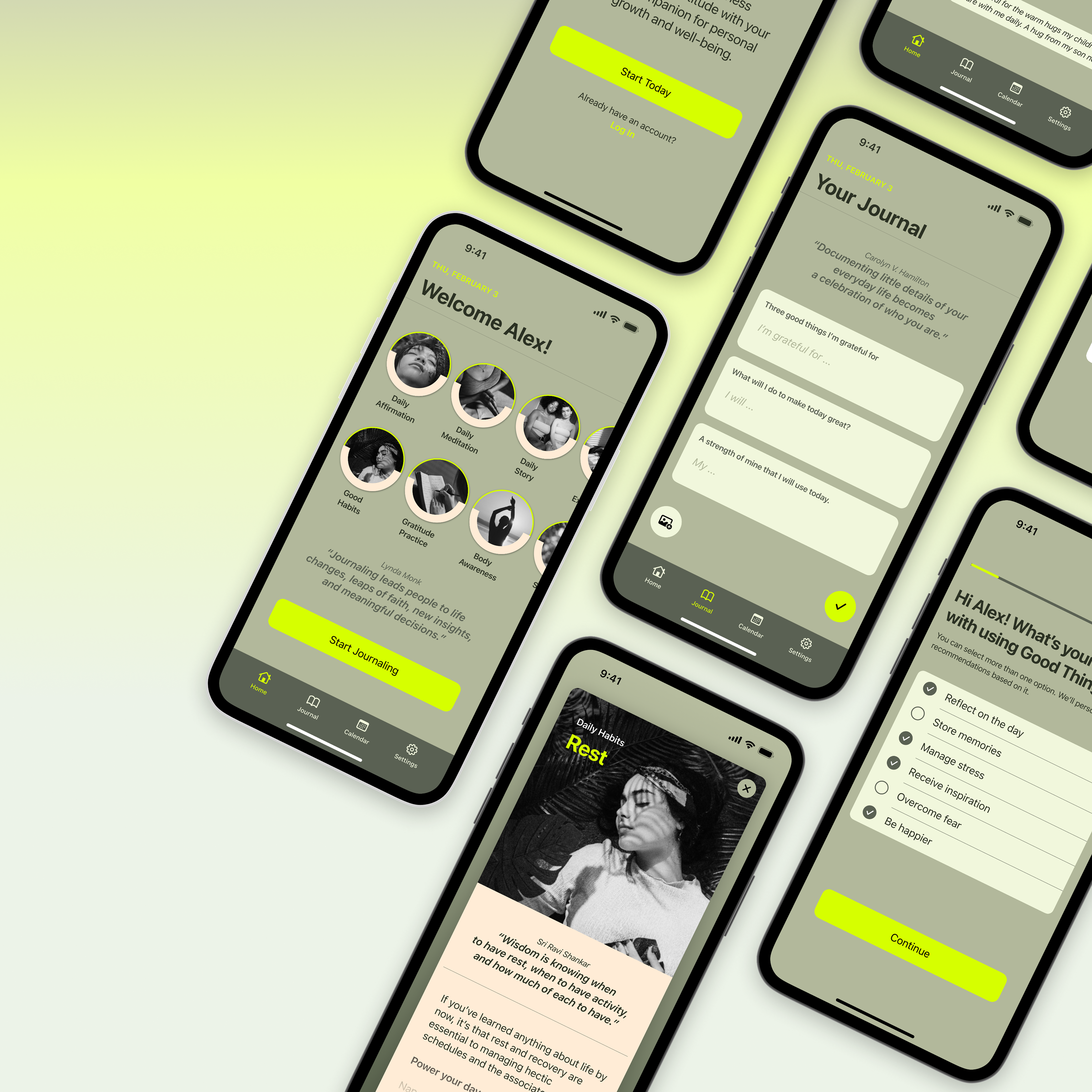

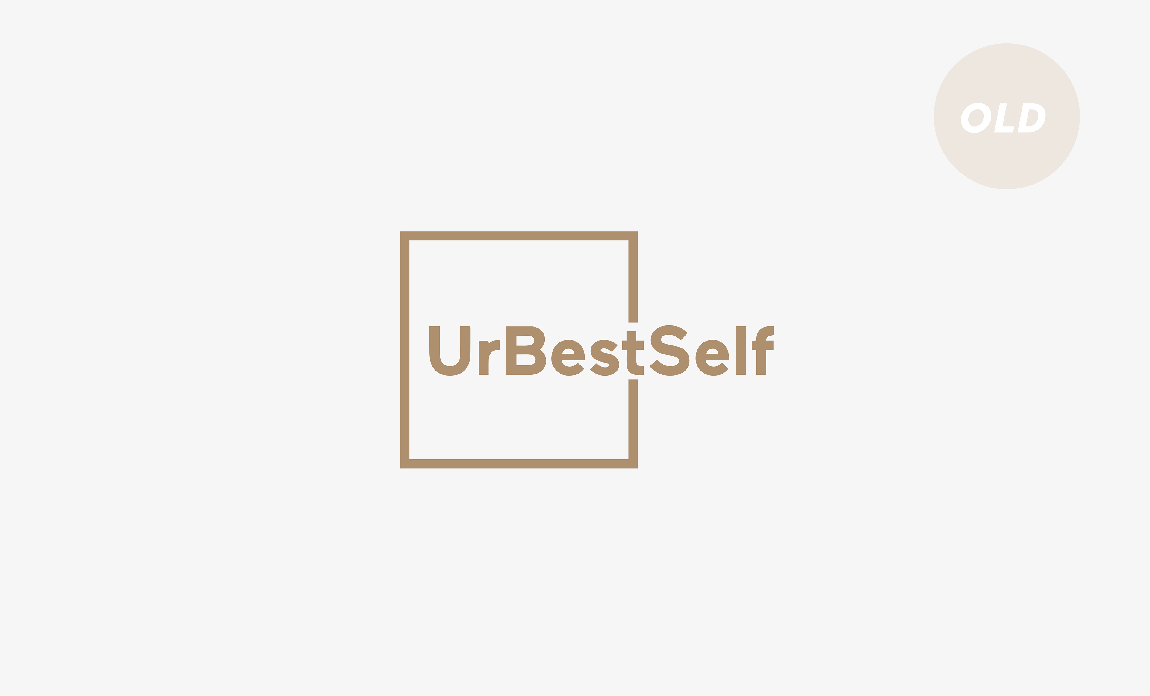
The Project
UrBestSelf GmbH is a fast-growing personal development startup known for its bestselling 6-Minute book series, used by over 2 million people in 21+ countries. With the brand evolving far beyond its original startup roots, the existing visual identity no longer reflected its maturity, purpose, or global presence. The challenge: to reimagine the brand experience—aligning it with core values like self-development, reflection, and personal growth—while maintaining its emotional resonance and broad accessibility.
My Role
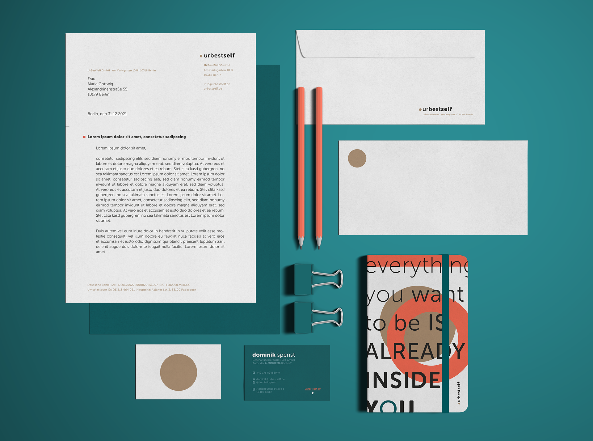
I was responsible for developing the new logo and core design concept—translating the brand’s evolved values into a cohesive visual identity. My work focused on brand system design, creative direction, and the strategic use of symbolism, typography, and color. Collaborating with Sevnur Acar-Spenst (Design Lead) and Cathy Bisenius (Social Media Design), we created a unified brand experience that balances emotional depth with visual clarity.
Brand Identity Design, Creative Direction, Conceptual Thinking & Visual Language Development
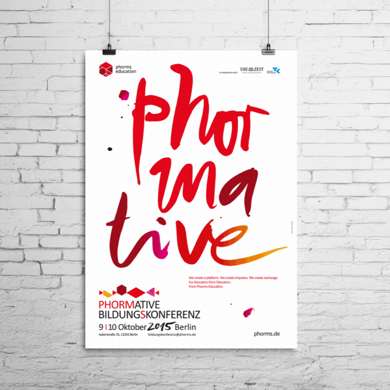
Design Components: Unleashing Exponential Growth
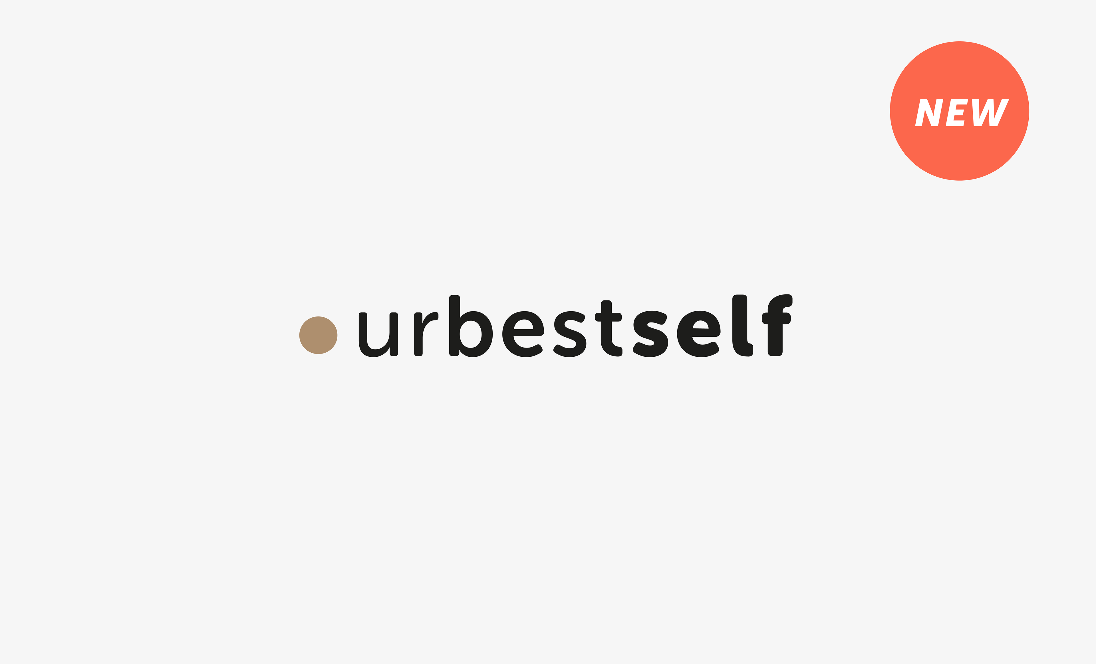

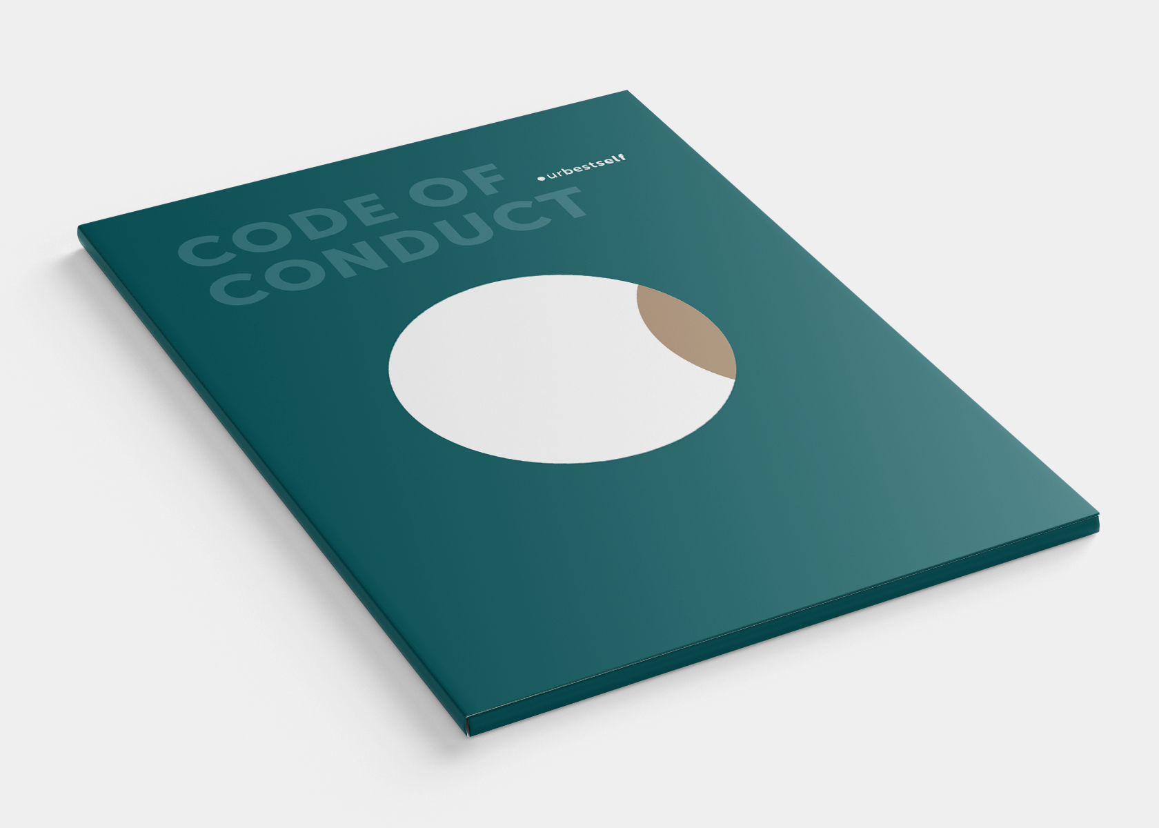
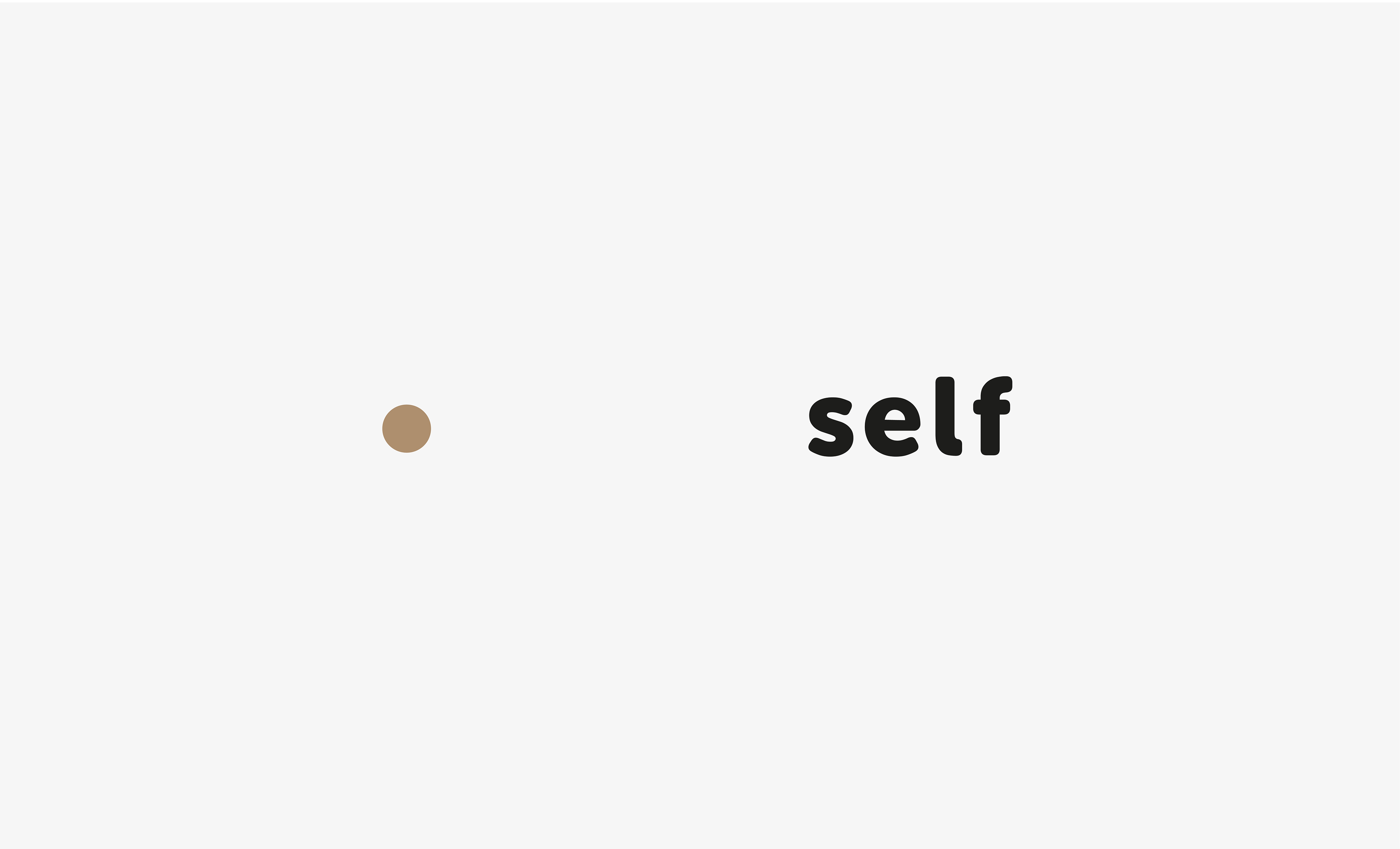
Visualizing Individual Essence & Development
The logo formulates a simple and widely recognizable composition, integrating a point/circle as a clear visual manifestation of the essential presence and role of the individual. From the self as initial starting point, emanates the name - vision and mission concurrently - with a crescent gradient of boldness towards the self. This simple yet effective gesture gives the compact logo a sense of freshness, youthful clarity, and symbolizes the brand’s commitment to positive growth.
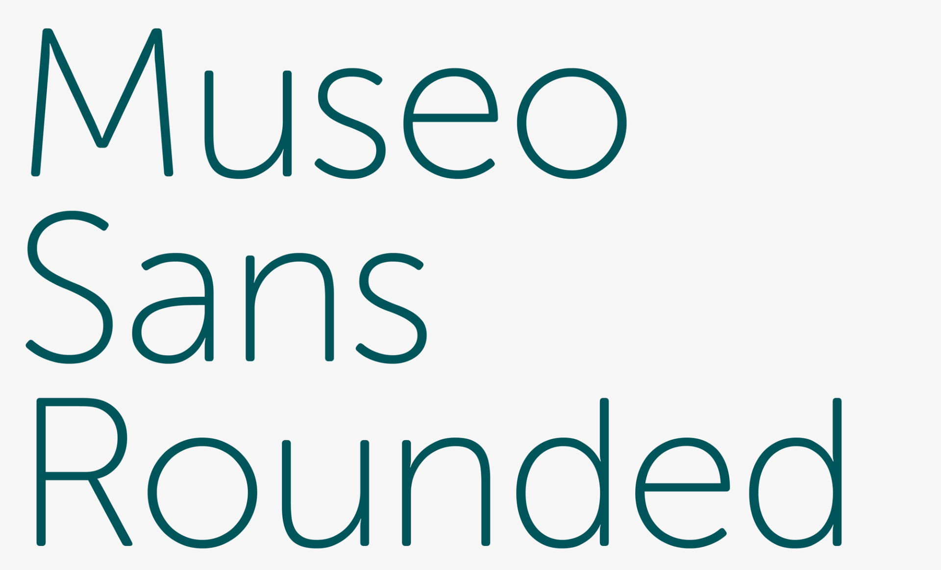

Typography
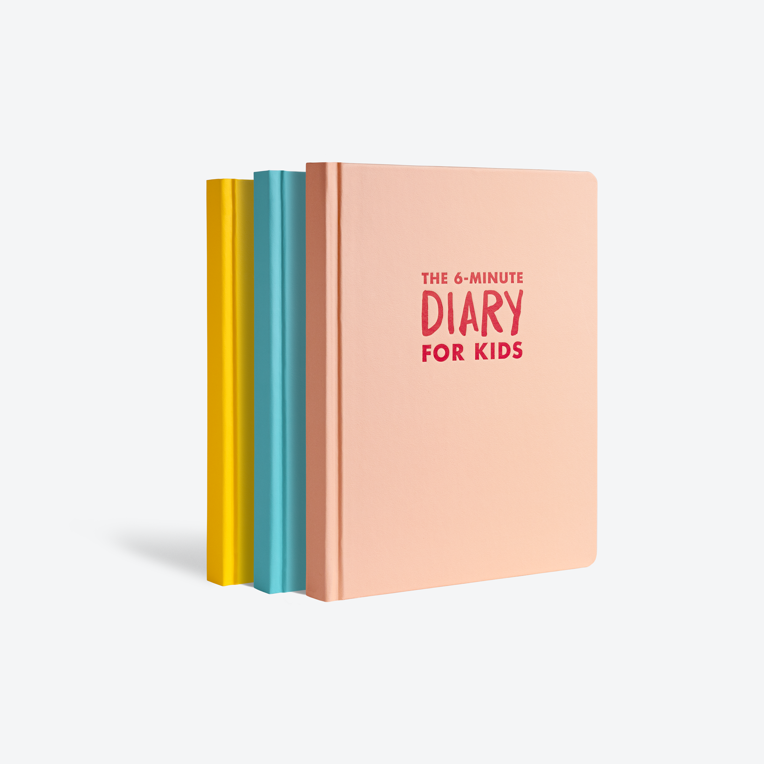
The exponential growth of the font weight underlines the "development" attribute. The Font Family Museo appears to be emotionally friendly and informative at the same time. The choice for the Museo Sans Rounded derives from the similarity to the 6-Minute stamp present on the cover of every German 6-Minute-Diary. This referral sparks an instant connection between the elements.
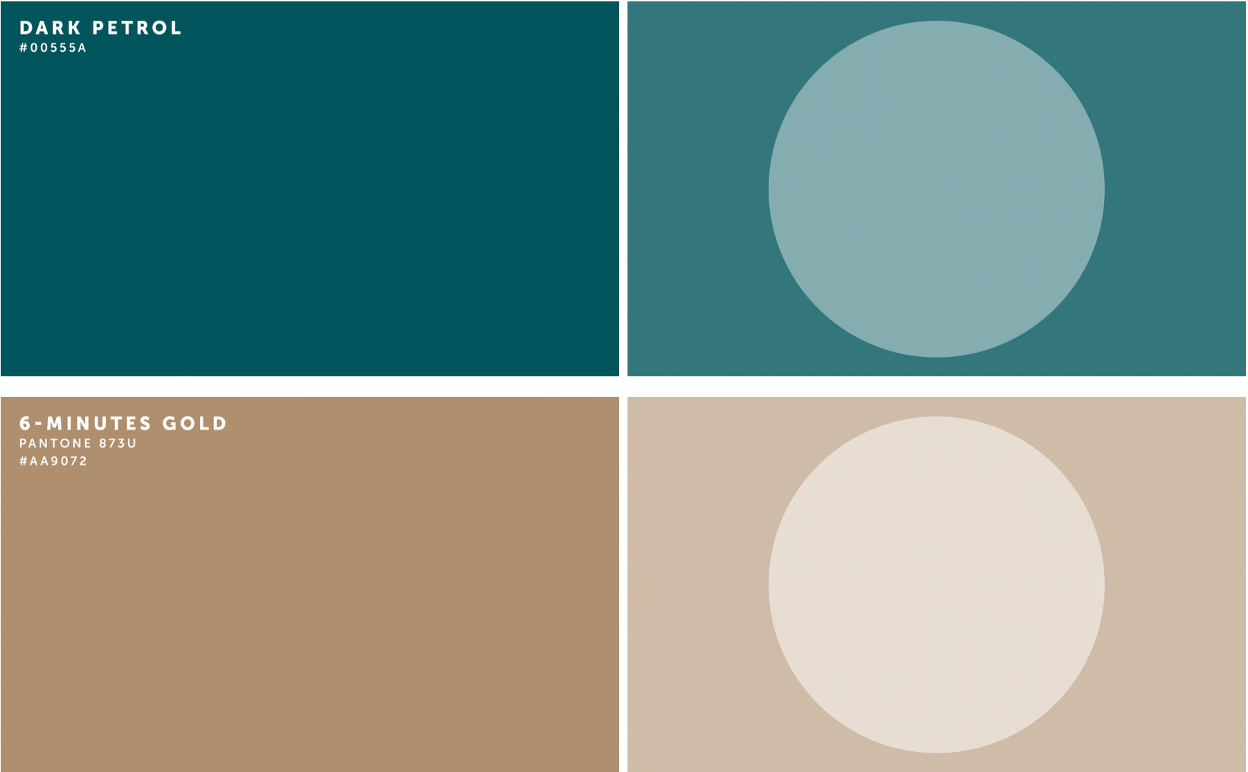
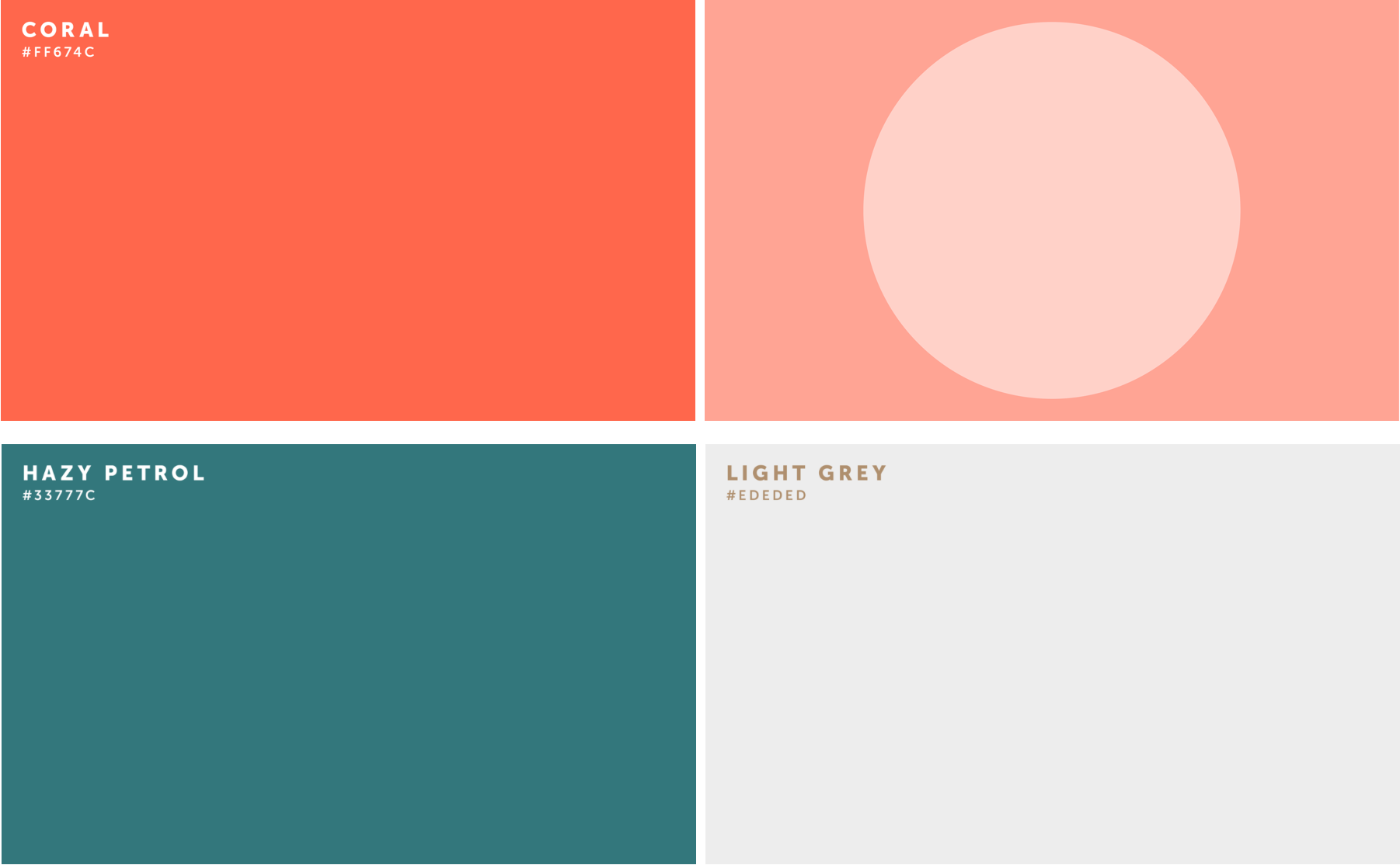
Corporate Colors
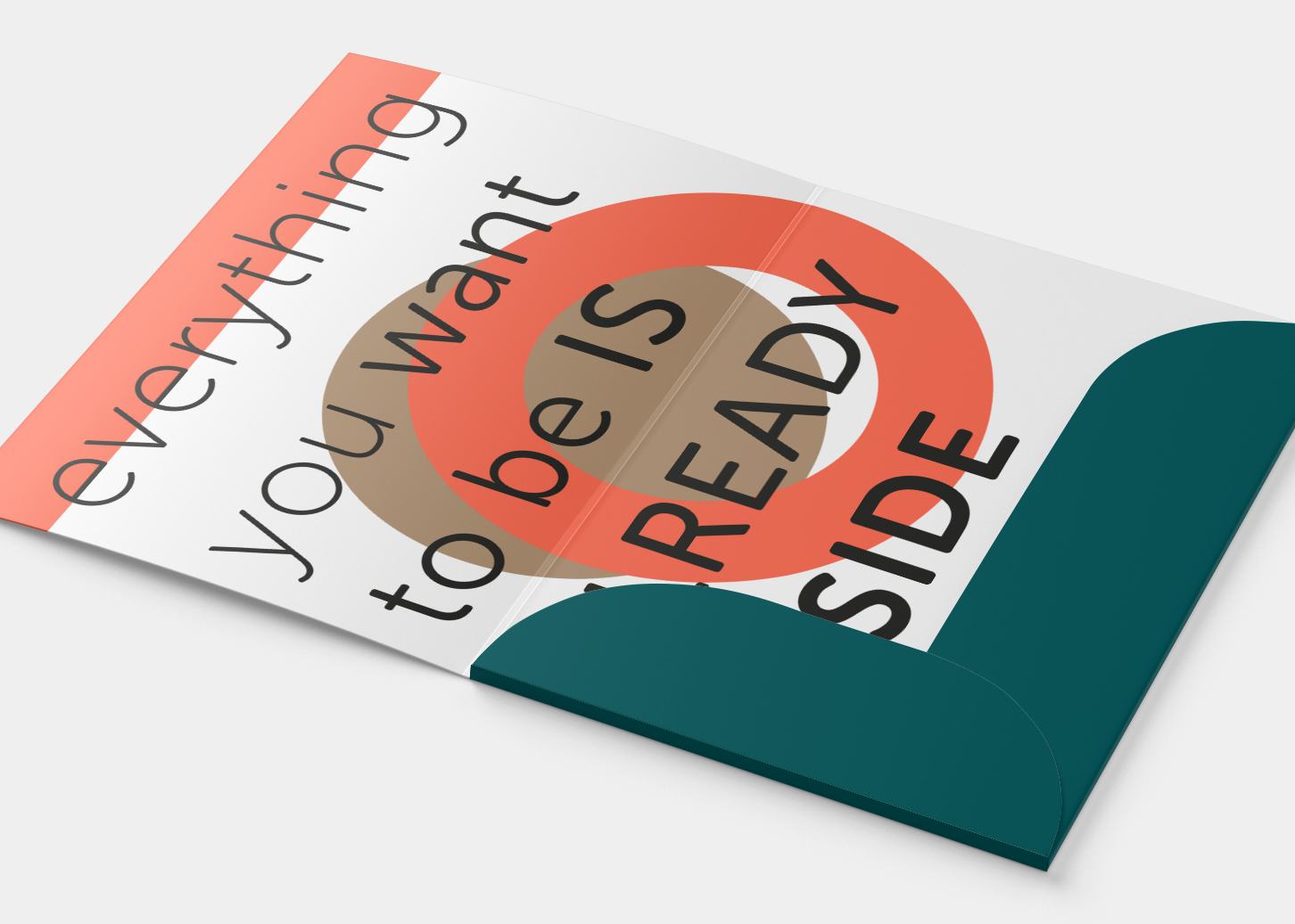
A careful and thought-out selection of colors was made, as a means to represent the values and mission of the company. Three main tones were selected: dark petrol - symbolizing introspection, gold - mostly used in the books and 6-Minute products - bringing in shine and a sense of quality and coral - providing refreshing vitality throughout.
_______________________________
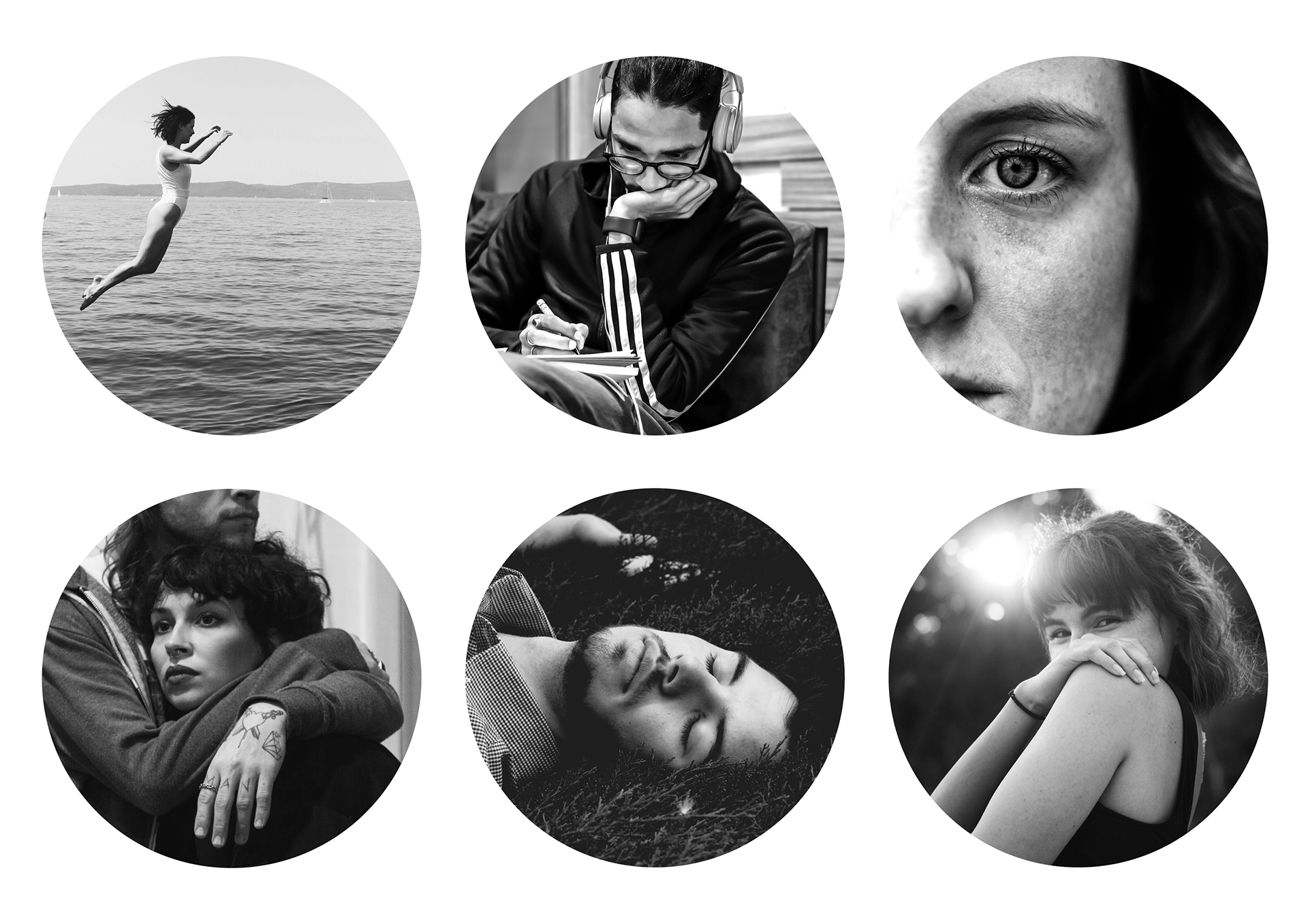
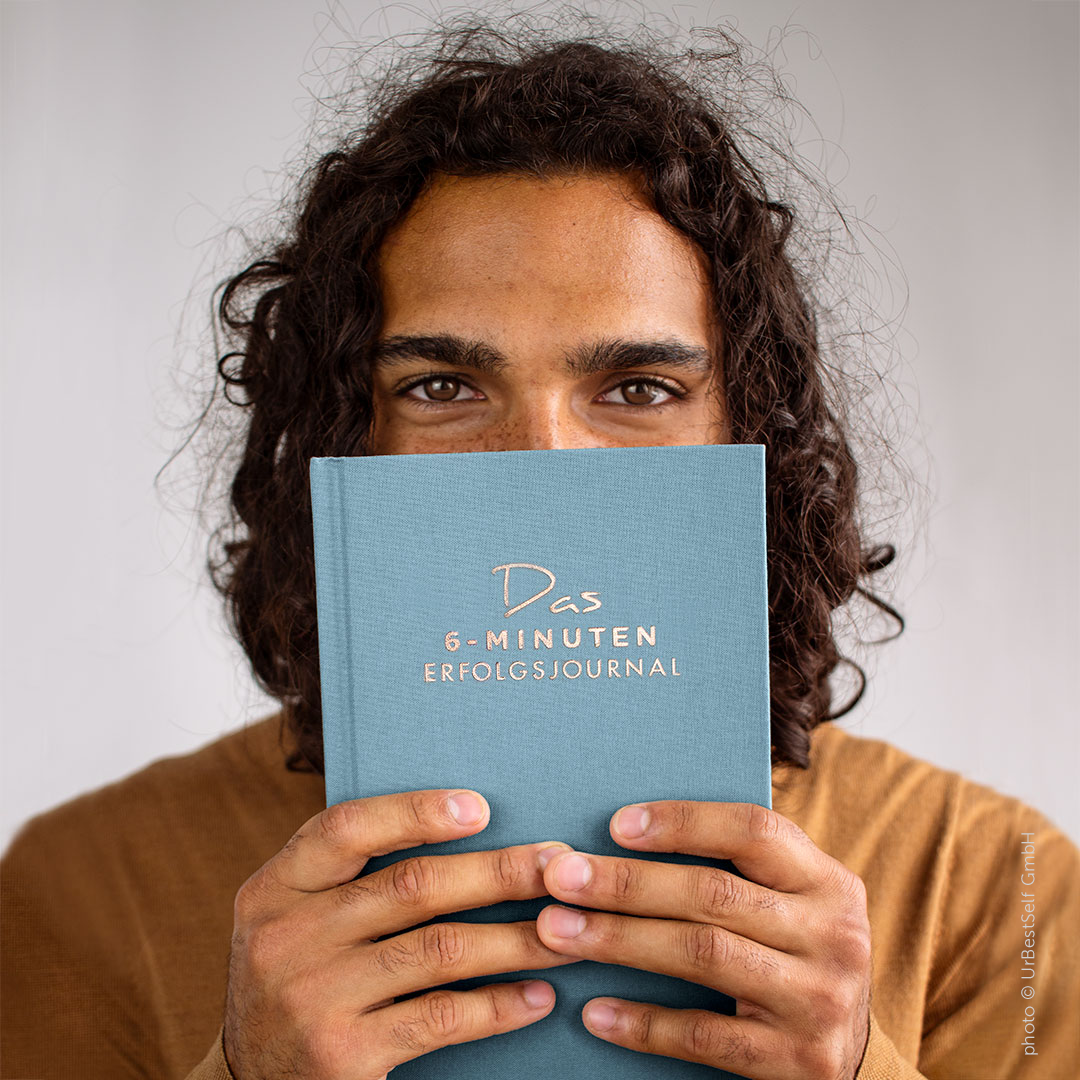
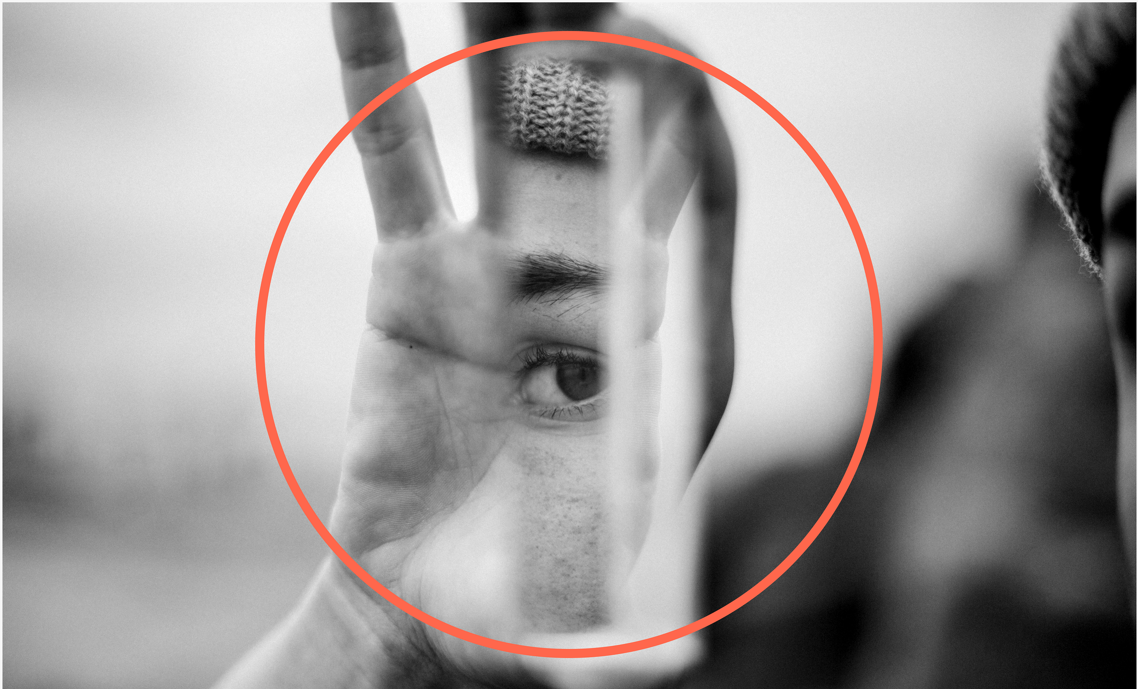
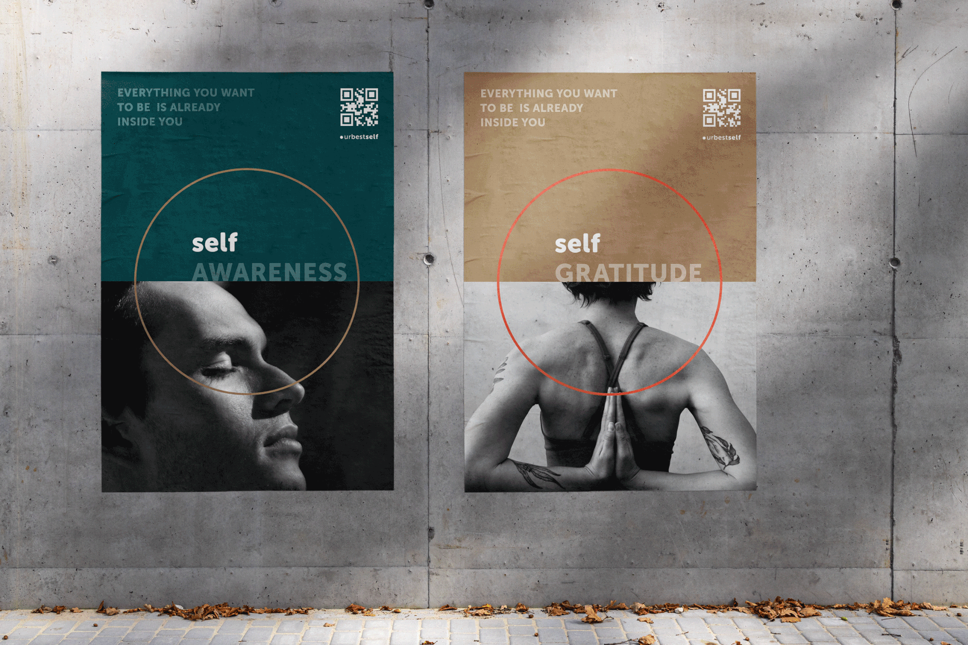
Authentic Narratives: Crafting Messages through Grayscale Imagery
The photographic material suggested by me aims at portraying the human being, specifically focusing on emotions and a sense of authenticity. Photographs in grayscale are used, mainly due to their neutrality and consequent capacity of being more easily perceived and read. As opposed to the vibrant colored photographs commonly used in advertising, the use of images in grayscale recalls a documentary-type aura, more appropriate and in-line with the objective, message and mission they serve.
_______________________________
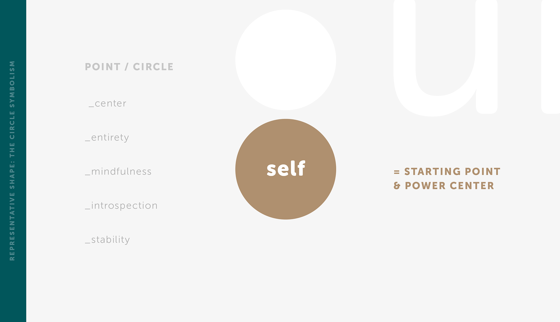
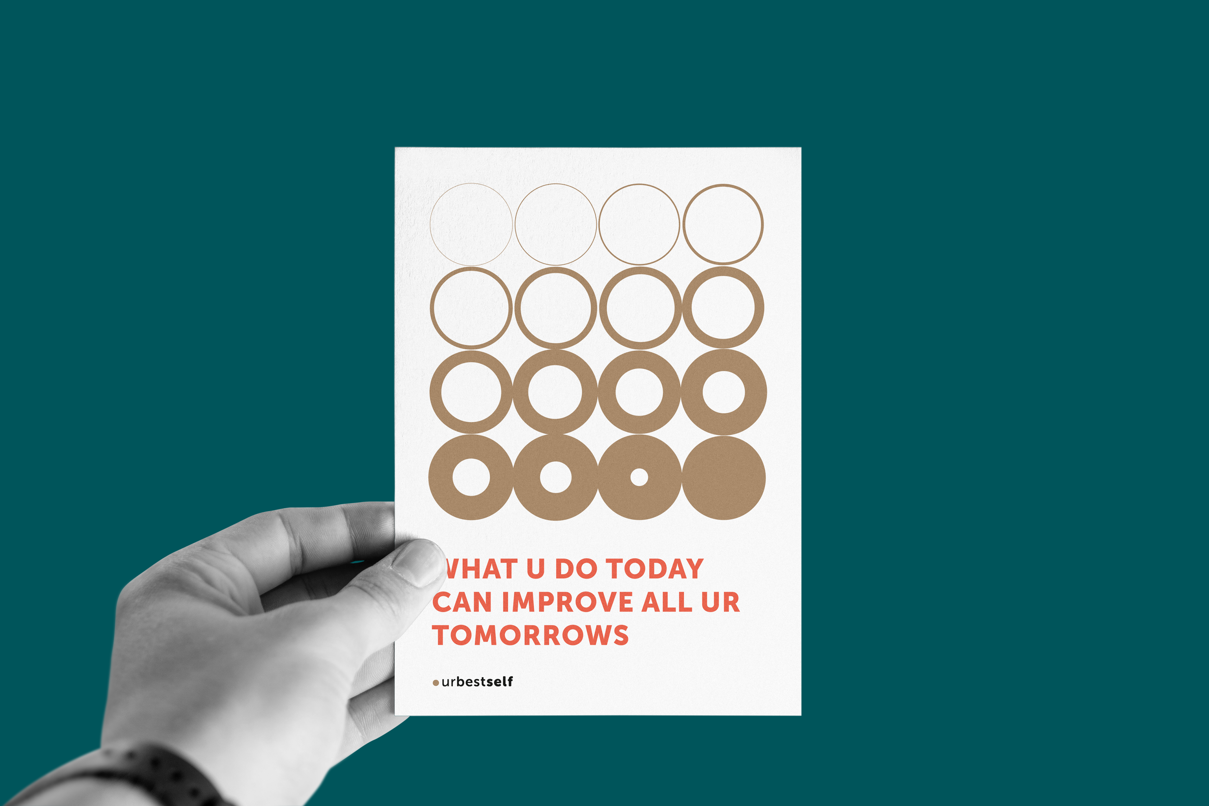
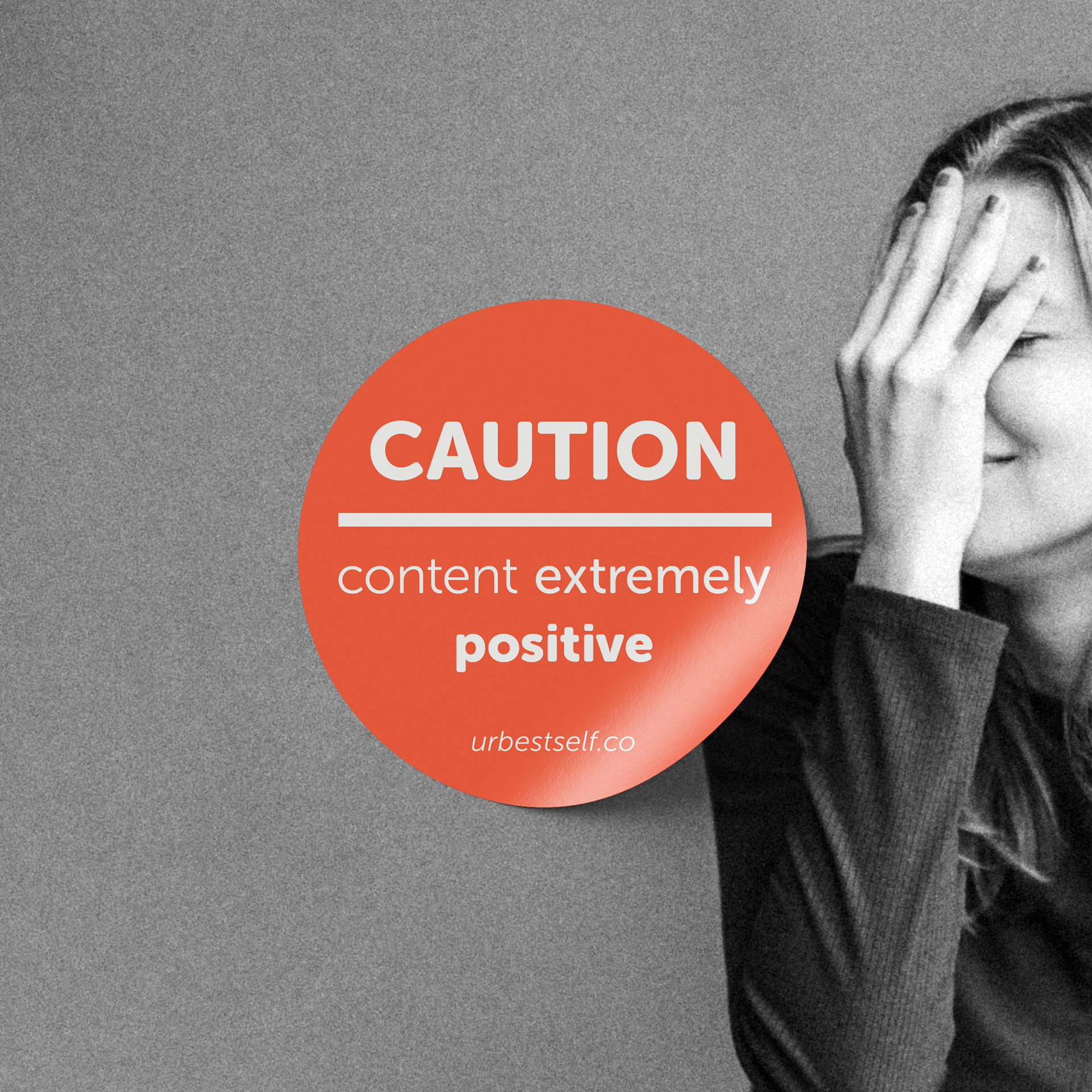
Circling Identity: The Crucial Element in our Graphic Concept
The role of the circle: As central element deriving from the logo it symbolizes the Self, as a catalyst and concentrated force for action. On a different level and through other forms of representation, it also suggests a clearly delineated, harmonious personal space, inside which one can be oneself. A place to rest; a place for consciousness and stability.
Within this frame of work, while the circular form is used as a symbol in itself, it also constitutes a template for framing symbols, messages or other graphic elements such as photos.
By translating UrBestSelf’s core values into a refined and emotionally resonant design system, we created a visual language that not only honors the individual’s personal development journey but also supports the brand’s continued growth and relevance.
This rebranding journey was more than a visual redesign—it was an exercise in aligning identity with intention. The result is an identity that feels both grounded and elevated—capable of evolving with its community while staying true to its core.